OsixthreeO employs a very simple grid system to create all the layouts. In fact it is so simple that anyone can use it.
Note: this is not really all that useful considering the column blocks available with WordPress block editor. The theme uses this system in a few spots so the css code isn’t going anywhere, might as well be aware of it.
Before the WordPress editor was updated and there were no blocks, this is what we used. It requires only a rudimentary understanding of how HTML & CSS work.
First thing to know is that all things in a HTML document (webpage) are enclosed in what we call tags. For example, the entire visible part of a webpage is enclosed in a ‘body’ tag which looks like <body> . . . </body>. Everything else, the header, all the text and images, etc… is within the opening and closing body tags.
A paragraph of text is enclosed in paragraph tags, <p> … </p>. We have the image tag, a blockquote tag, bold, italics, you name it. We also have the generic <div> … </div> tag for things like layout. For example, if I wanted to make columns of text I would need containers to put the paragraphs of text in so they could be in stacks that are next to each other. These containers would be ‘div’s.
In HTML two div tags, each with some paragraphs in them would look like this…
<div>
   <p> ... </p>
   <p> ... </p>
   <p> ... </p>
</div>

<div>
   <p> ... </p>
   <p> ... </p>
   <p> ... </p>
</div>
Divs and paragraphs are block elements though. This means that they take up the entire width of the browser pushing everything else down, just like adding a block of wood to a stack of blocks, all the others are displaced vertically.
CSS to the rescue
With CSS we can define the attributes of an element, for example we can tell a div to only be 50% of the browser width and to shift to the left making room for a 2nd 50% width div … and we have columns.
To do this we need the instructions (be only 50% and shift to the left), and a way to attach those instructions to the HTML we wrote (above).
With CSS we can write those instructions and define them as a ‘class’. Then all we have to do is assign that class to the div like so … <div class=”css-class”> … </div>
The Grid
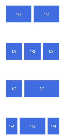
The “instructions” to create the columns mentioned above are already written, loaded and being used in this theme. It is an 8 column grid.
To make a div a 50% width, shifted to the left column add the class ‘col-1-2‘.
col for column. 1-2 for one half.
Available column classes are:
col-1-2
col-1-3, col-2-3
col-1-4, col-3-4
col-1-5, col-2-5, col-3-5, col-4-5
col-1-6, col-5-6
col-1-7, col-2-7, col-3-7, col-4-7, col-5-7, col-6-7
col-1-8, col-3-8, col-5-8, col-7-8
Margins
Columns need a margin and these columns have one HOWEVER, it is a left margin and we do NOT want a left margin on the first column. To solve this we simply add a second class of ‘first’ on the first column.
<div class="col-1-2 first">
   <p> ... </p>
   <p> ... </p>
   <p> ... </p>
</div>

<div class="col-1-2">
   <p> ... </p>
   <p> ... </p>
   <p> ... </p>
</div>
Some other ways to use the grid…
<div class="col-1-3 first">
   <p> ... </p>
</div>

<div class="col-1-3">
   <p> ... </p>
</div>

<div class="col-1-3">
   <p> ... </p>
</div>
<div class="col-1-3 first">
<p> ... </p>
</div>
<div class="col-2-3">
<p> ... </p>
</div><div class="col-1-4 first">
<p> ... </p>
</div>
<div class="col-1-2">
<p> ... </p>
</div>
<div class="col-1-4">
<p> ... </p>
</div>